Process
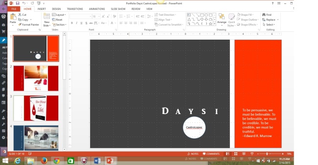
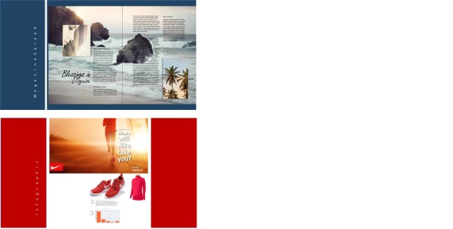
This is my final project which was to make a slide share of all the projects I have completed throughout this Spring quarter. I was able to do this by compiling all my work and creating a Power Point to show case them. I added color bars to each slide to match the color theme of each project to give it some design but also to give the slides some repetition and unity. I kept a simple 18 pt. font in all the slides and added an introduction slide with my name and a quote. I also created the last slide repeating my name and logo with a brief tagline” Aiming to succeed expanding your vision” as a way to close with an appealing phrase.
Critique
I had my instructor Julie Peterson critique my work through the live demo and she suggested I change the bars on the right side with the titles to the left instead to bring the eyes to the right where the work is show cased. She also suggested I don’t center my title slide with my name and to move it to the bottom right instead along with the quote to add some interest and same with the last slide. She also cautioned my to check some of my images that looked a bit stretched. She liked the vertical titles and the color bars that matched each project. I also had Rebecca Stallard Garcia critique my work through the Facebook class page and she suggested I make all the font tittles the same size. I followed all the advice given and felt it improved my project greatly. Hope you enjoy the slides.
Fonts
Daysi-AR JULIA( Serif), Logo and text box-Calabri(Sans Serif), Subtitles- Corbel(Sans- Serif)
Sample other work by Cristy Crawford https://cristyinfocus.wordpress.com/category/design

This is so great Daysi! I loved seeing all of your projects from the semester here. I love your slide layout with the vertical font. I really like how you manipulated the image of your event flier to be at an angle – that was a refreshing twist. I also like how you coordinated your color schemes.
Check out my project at: https://cristyinfocus.wordpress.com/2015/07/17/13a-final-portfolio/
LikeLike
Daysi I enjoyed getting to work with you this semester. I love your ideas and the way your final project came together. It is very crisp and fresh and flows wonderfully. Your new cover and final pages look great and very professional. I hope you enjoyed the class. You can see my work at: https://michellepalmatier.wordpress.com/2015/07/16/final-presentation/
LikeLike
Daysi, Love you presentation. It is very professional. Any potential employer should be impressed by it. You should place it on your Linked In page.
Here;s the one Travis Briggs created – https://twentyone4thstreet.wordpress.com/2015/07/18/portfolandia-6/comment-page-1/#comment-34.
Susan Ruske
LikeLike
Daysi, I’m very impressed with your final portfolio. It is very well designed and I like the way you present each title, up and down instead of across. It looks awesome. Thanks for all your help this semester! It’s been fun. Godd luck!
LikeLike
Nice job keeping a consistent look while changing the colors to fit your project. I like that you moved the titles over to the left side of the slide, I think they work better over there. Good job!
LikeLike
It is always fun to look back on the work that we have accomplished throughout the semester. You have such a great job, and I hope you success in the future. You should check out Jim Bob Farley’s blog, he had some excellent work as well: https://jbfarleydesign.wordpress.com/2015/07/17/final-portfolio/
LikeLike